
Brand Strategy and Storytelling
A brand-strategy and storytelling project for Wellstreet, developed through research, facilitation, and visual design. Deliverables: Brandbook · Website Prototype · Google Slides Template.
Brief / Challenge
We worked with an early-stage investment company undergoing a brand evolution. The challenge was to help the brand move into its next phase — becoming more human, energetic, and forward-facing — while maintaining credibility, trust, and a minimalist foundation. The project required us to:
- Analyse brand context, audience, and competitors
- Develop a clear and consistent brand platform
- Communicate the brand through storytelling, visual design, and tone of voice
- Present and pitch the work to a professional client
Research & Brand Strategy
Before developing the brand direction, we focused on understanding Wellstreet, its audience, and the competitive landscape. Our research combined: Brand & competitor research across Nordic and international VC brands. A founder-focused survey exploring expectations around communication, trust, visual identity, and website experience. Research synthesis to identify recurring patterns and translate them into strategic criteria. Regular client feedback throughout the development process. This gave us a research-based foundation for defining the brand direction.
From Research to Direction
Across our research, three themes consistently shaped what founders expected from an investment brand:
Clarity & Transparency
Founders valued straightforward communication, clear processes, and honesty.
Human Partnership
They wanted an approachable, respectful partner with evidence of real support beyond capital.
Credibility Without the Corporate Feel
Professional and trustworthy, but without hype, buzzwords, or overly corporate expression.
These insights shaped our direction: creating a more human and distinctive brand expression while maintaining credibility and trust.
Visual Exploration — Finding the Right Expression
We translated the research insights into different visual directions, exploring how Wellstreet could feel more human, confident, and distinctive while maintaining credibility.
Through client feedback, we refined the visual direction toward a stronger, more confident expression that balanced personality with credibility.
Building the Brand System
The selected direction was developed into a cohesive brand system, translating the strategy into voice, colour, typography, photography, and motion.
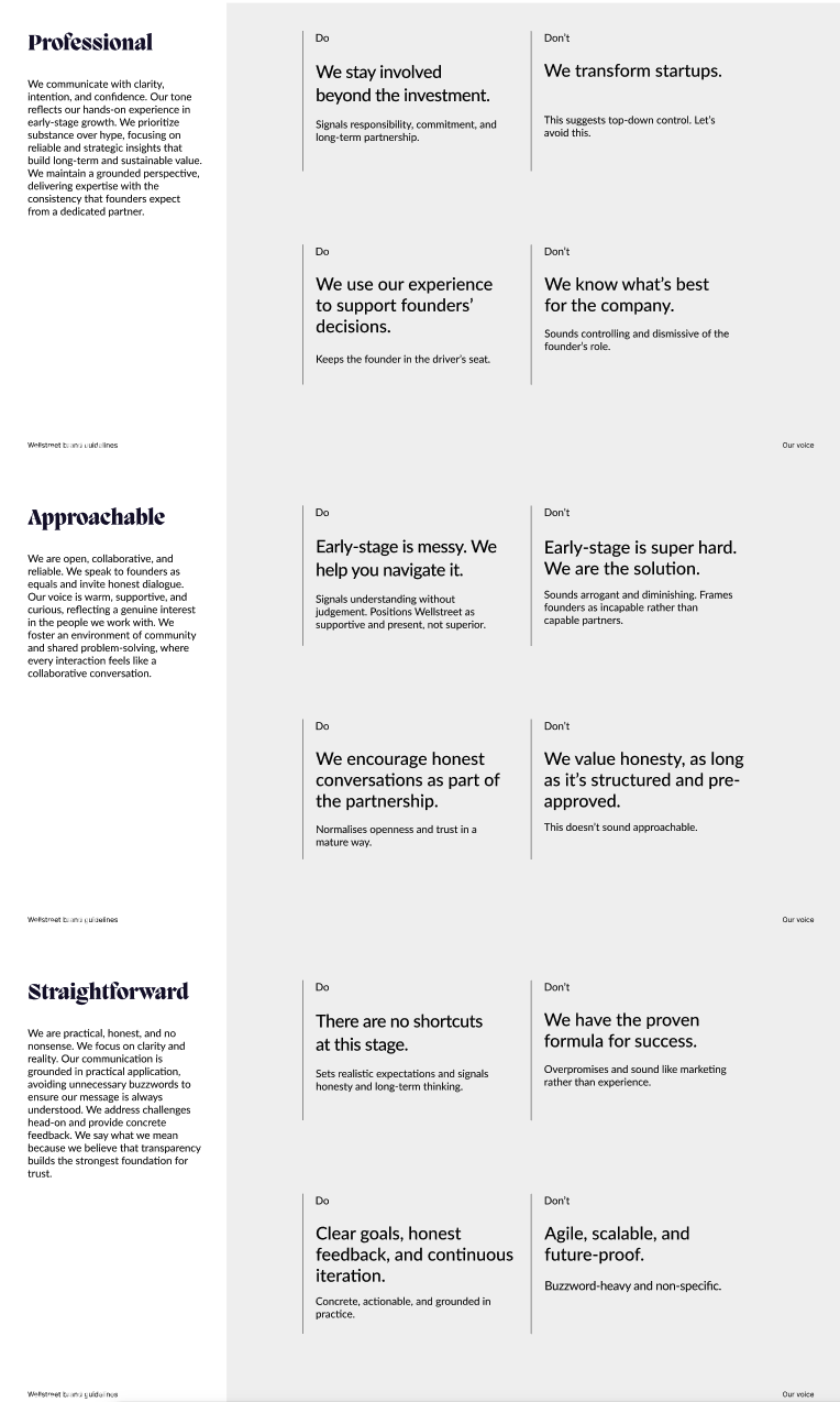
01 — Tone of Voice
Professional, approachable and straightforward — designed to communicate expertise without losing warmth or honesty.
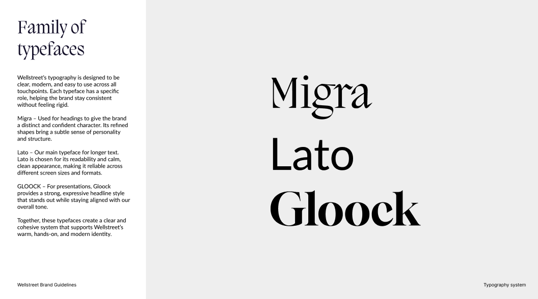
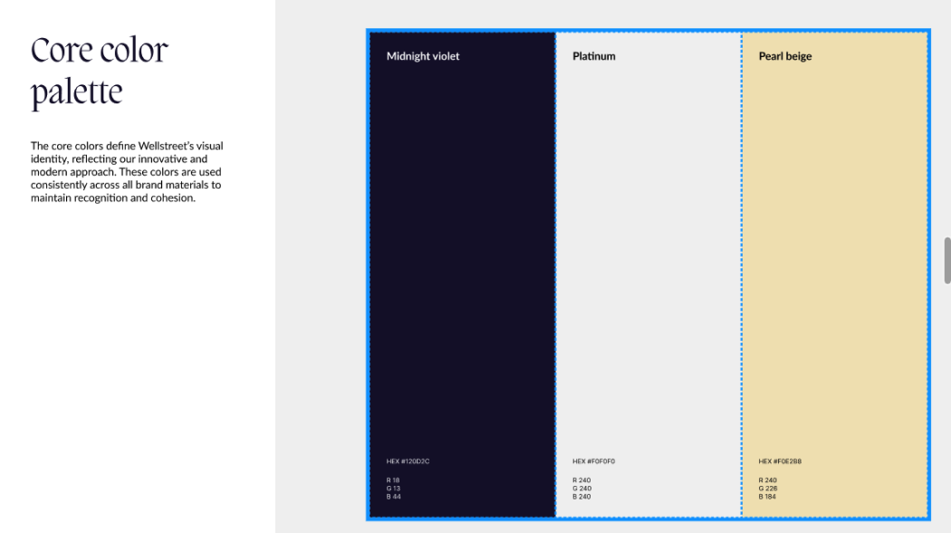
02 — Typography + Colour
A distinctive typographic system and restrained colour palette balance personality, clarity, and credibility.
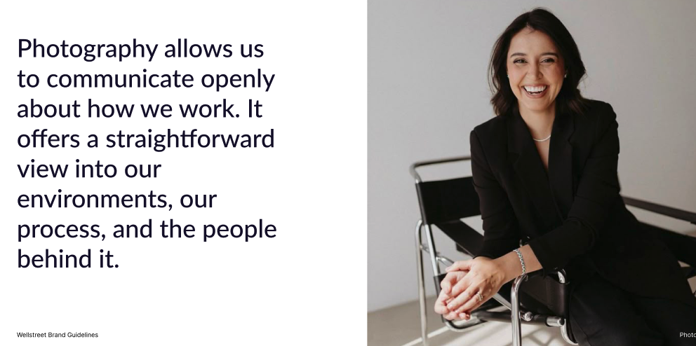
03 — Photography
Real people and real environments bring a more human and transparent expression to the brand.
04 — Motion
Motion extends the identity digitally, using the angle of the Wellstreet slash to create a recognisable visual language.

Bringing the Brand to Life
Beyond the brandbook, we applied the new identity across two key touchpoints to demonstrate how the system could work in practice.
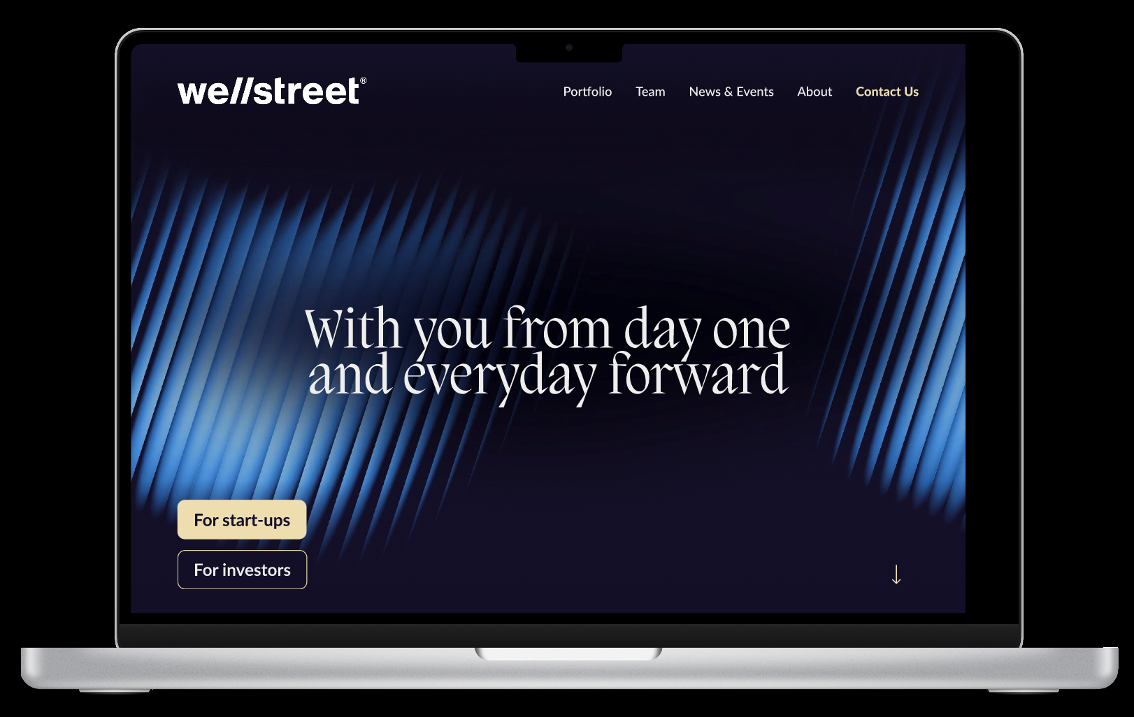
01 — Website Prototype
The website brings the brand strategy, visual identity, tone of voice, and motion together into a cohesive digital experience.
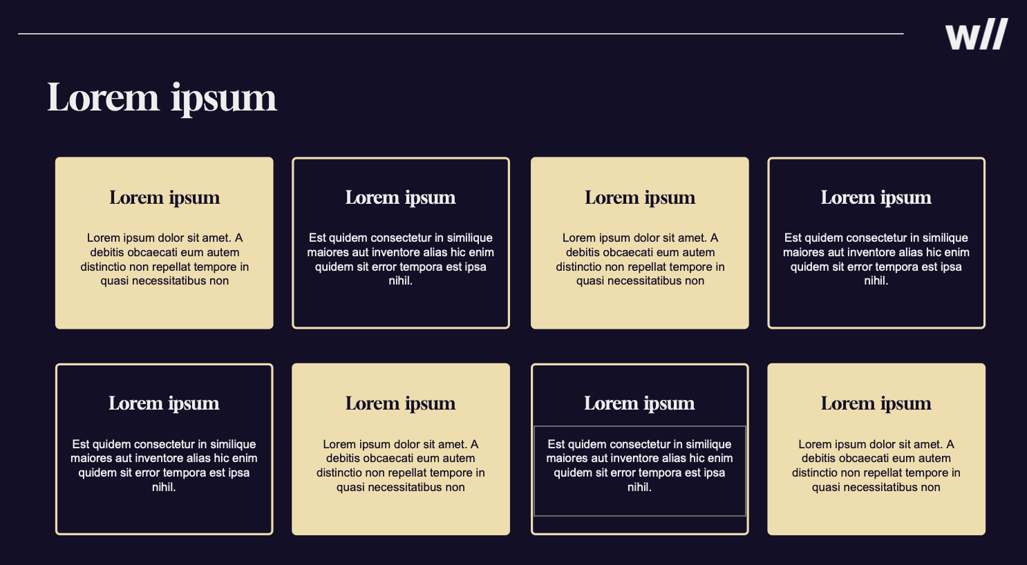
02 — Google Slides
The presentation template extends the identity into everyday communication, creating a consistent system for presenting Wellstreet to different audiences.
My role - Facilitator & Strategic Contributor
My primary role was facilitator, supporting team alignment, communication, and progress throughout the project. Alongside this, I contributed directly to research and key parts of the brand system.
01 — Facilitation & Team Alignment
Facilitated check-ins and discussions, helped surface blockers, and supported open communication using principles from Nonviolent Communication.
02 — Research & Synthesis
Contributed to audience and competitor research and helped translate findings into insights that informed the brand direction.
03 — Brand Development
Contributed to the typography system and developed the LinkedIn guidelines, helping translate the strategy into practical communication tools.
Reflection & Learning
This project changed how I think about branding. I learned that building a brand is much more than creating a visual identity — every decision needs to connect back to the audience, the strategy, and what the brand wants to communicate. Working with feedback throughout the process also taught me to become more comfortable with iteration. Some of our early ideas changed significantly, and I learned that letting go of a direction can be necessary to create something stronger. As a facilitator, I also experienced how important communication and alignment are when different perspectives need to come together around one creative direction. The project strengthened my interest in work where facilitation, strategy, and creative collaboration come together.